Monday, December 31, 2012

Crymble Awards: Digital Humanities & History Best of 2012

In keeping with the tradition I established last year, I thought it fitting to again take a moment on the last day of the year to acknowledge some of the people and projects that inspired and influenced my academic growth the most in the past year.

These days there is much talk about the impact of research - particularly in the UK with the impending "REF" that has academics across the country scrambling to demonstrate that they are "world class". We're always looking for ways to quantify who has the most influence, and unfortunately that's more often than not meant counting up citations. But the people I cite are not always the ones who have given me most cause to think, or those whose efforts I've appreciated the most. And that's where the Crymble awards are important for me. They're a chance to acknowledge that which often goes unacknowledged. And a chance to challenge the notion that a footnote is the only worthwhile measure of success.

Last year the awardees included six men who worked on five projects: Tim Hitchcock, William J. Turkel, Tim Sherratt, Ben Schmidt, Sean Kheraj, and Jeremy Boggs. Though all six continue to produce inspiring work, I've decided to exclude past winners. I will however stick with five projects as the magic number of awards. And this year I'm pleased to say the gender imbalance is improving - if only slightly.

In no particular order, I present this year's winners:

  • Julia Flanders, "Faircite: towards a fairer culture of citation in academia"

    I emailed the journal Digital Humanities Quarterly back in January to suggest that the journal adopt fairer citation practices that would see a wider range of team members on collaborative digital humanities projects credited publicly for their work. The response I got from Julia the editor was astounding, full of energy and enthusiasm. She encouraged me to pursue the matter further, gave the idea a catchy name, and even helped put together a formal proposal for the Alliance of Digital Humanities Organizations which she supported and presented. I'm happy to report a number of projects have responded positively to Faircite and have begun offering more inclusive suggested citations that acknowledge the work of their team members - a trend I hope to see continue to grow. (See the Old Bailey Online, and Voyant Tools for examples). Thanks to Julia for her support.
 
  • Luke Blaxill, "Quantifying the Language of British Politics 1880-1914" Paper presented at King's College London, 2 November 2012.

    Luke's a (recently) former colleague of mine at King's College London. His work ties together corpus linguistics with historical inquiry in a way that's so simple, yet so effective. What I love about Luke's research is that his distant reading approach to history has so effectively challenged conventional historical wisdom in a way that close reading could never highlight. I've incorporated many of the principles and tools I learned of through Luke into my own research. You can hear a version of his talk on the IHR History Spot archive. For those of you looking for a digital humanist with some great textual analysis skills, you'll be happy to hear Luke has recently received his doctorate in history and digital humanities, and I'm sure he'd love to hear from you!

  • Peter King, "Ethnicity, Prejudice and Justice, The Treatment of the Irish at the Old Bailey 1750-1825" (under review).

    It's always a little frustrating to find someone's just published the very topic you had been working on. But in this case, the experience turned out much better than I could have hoped for. Peter King is a Professor of History at Leicester University and very willingly shared his pre-publication work with me, has answered questions, provided advice, and even made a trip down to London to watch me present a response paper to his work. I think it's fair to say he has been amicably combative about my work, and has pushed me to continue to improve.

  • Andrew Marr, The Open University et al. "Andrew Marr's History of the World" BBC One. Television Series: October-November 2012.

    This one may perhaps look like the "one of these things just doesn't belong here" entry. Andrew Marr is a BBC journalist who presented an eight-part "world history" this autumn in the UK. I found myself unable to get enough. The team behind the series did an amazing job of finding specific examples to illustrate broader themes that captured what was unique about entire civilizations. It forced me to consider the scope of my own piddly 20 year local study and how that fits into the broader spectrum of human history. Kudos not just to Andrew Marr, but also to the Open University and everyone involved in the project. I'm sure there were many of you.


  • Fred Gibbs and Miriam Posner "The Programming Historian 2"

    Fred and Miriam joined the Programming Historian 2 team of which I'm a part right at the beginning and have been been invaluable to getting the project off the ground. Miriam has taken on the role of our outreach officer, and Fred one of our general editors. Thanks very much to both of them for all their hard work on the project. (And though I said I wouldn't re-award past winners, I feel compelled to mention that William J. Turkel and Jeremy Boggs are also instrumental team members!).
Thanks to this year's winners for all your inspiration.

Tuesday, December 4, 2012

How to Download Multiple Records using Python

I'm pleased to announce my latest endeavour to teach historians how to program computers in aid of their research has been published and is freely available on the Programming Historian 2 website.

Full Lesson: Downloading Multiple Records Using Query Strings

The hands-on lesson builds upon some introductory Python tutorials also available on the site and is intended to teach practicing historians how to use Python to discriminately download a copy of sources found in scholarly databases to their own computer for further processing. Thanks to Fred Gibbs, Miriam Posner, and Sara Palmer for their assistance working the lesson into shape. The abstract is available below:

Downloading Multiple Records Using Query Strings

Downloading a single record from a website is easy, but downloading many records at a time – an increasingly frequent need for a historian – is much more efficient using a programming language such as Python. In this lesson, we will write a program that will download a series of records from the Old Bailey Online using custom search criteria, and save them to a directory on our computer. This process involves interpreting and manipulating URL Query Strings. In this case, the tutorial will seek to download sources that contain references to people of African descent that were published in the Old Bailey Proceedings between 1700 and 1750.

For Whom is this Useful?

Automating the process of downloading records from an online database will be useful for anyone who works with historical sources that are stored online in an orderly and accessible fashion and who wishes to save copies of those sources on their own computer. It is particularly useful for someone who wants to download many specific records, rather than just a handful. If you want to download all or most of the records in a particular database, you may find Ian Milligan’s tutorial on Automated Downloading with WGET more suitable.

The present tutorial will allow you to download discriminately, isolating specific records that meet your needs. Downloading multiple sources automatically saves considerable time. What you do with the downloaded sources depends on your research goals. You may wish to create visualizations or perform various data analysis methods, or simply reformat them to make browsing easier. Or, you may just want to keep a backup copy so you can access them without Internet access

Thursday, November 15, 2012

Providing A Familiar Assessment Process for Digital Projects


"Trust Me" by Anderson Mancini
A few weeks ago in my Early Modern British History tutorial the students read a book review that had been printed in a scholarly journal. I asked the students, “Why are we reading this? What’s the point of this piece of writing?”

My cynical self tried not to let on what I was thinking: wasn’t it written so some PhD student could score a free book and put another line on his C.V.? My students thankfully didn’t see it that way.

Historical writing generally comes in one of a handful of tried-and-tested forms. In the course I teach we usually read and discuss articles published in peer reviewed journals. The students are now used to the goals of that particular mode of writing. They know it contains a historian’s contribution to a particular scholarly discussion, which is fairly narrowly defined and tends to correlate rather strongly to the topic we’re discussing that week in lecture.

They understand edited collections contain a series of articles by different authors on a theme defined by the editor. They know books (or monographs as historians like to call them) cover broader topics than a journal article, but they expect to find chapters in those monographs that rival the scope of an article. And for a first year undergraduate, that about covers the known forms of printed historical research.

Scholarly book reviews are generally a fairly new beast for the students. My question about the value of book reviews was of the type I knew I would not have been able to answer as a first year undergraduate, but I’m blessed with very clever students who had all manner of ideas. My favourite comment was that a book review:

provides another perspective on the strengths and weaknesses of the work, which are important to keep in mind when coming to our own conclusions about the author’s arguments.

I believe that idea holds the key for digital humanities scholars, many of whom feel their colleagues have been unwilling to award due credit for digital projects. However, the problem is not necessarily an unwillingness; the problem is that most people aren’t qualified to assess digital humanities work, so they just don’t. Forcing someone to assess something without the skills to do so is not the answer. I think most of us would prefer that a review of our work came from someone with the background to assess it fairly.

Scholarly reviews are a great platform for that assessment process for two reasons. Firstly, they take a form that nearly all humanities scholars already understand. Secondly, they allow the digital humanities community to self-define the major projects so that non-digital colleagues don’t have to.

Familiar Clothes

Like my students, most scholars can visualize where a review fits amongst the various scholarly apparatus floating around in the intellectual space in which we share and critique each other’s work. They understand that a quality review in a reputable journal represents an arms-length critical evaluation of the work by someone with the skills to make the assessment. Reviews certainly are not a perfect model. There is clearly a risk to any creator or team that they will get an unfairly negative treatment by someone who perhaps is not as qualified to write the review as they may think. But this is the same risk authors of monographs face, and to me, the benefits far outweigh the risks.

The world of publishing is changing, but there’s something to be said for making something look familiar. The Journal of Digital Humanities has taken this approach by experimenting with new ways of finding content that is important to the scholarly development of digital humanities – although I imagine that process of identifying content would look rather shocking to a typical historian or English lit. professor. (If you’d like to learn more about that project read their “How to Contribute” page.) However, by wrapping it up in the clothes of a traditional peer reviewed journal, the editors get to experiment, the authors get credit for their contributions, and the readers are drawn to some of the best ideas that appear online. Everyone wins.

For me, the Journal of Digital Humanities has represented a great success as a project that has been able to forge ahead, while acknowledging that sometimes it’s a good idea to change things gradually. In that project, the team decided to make sure they held onto some familiar concepts. They registered an ISSN number (2165-6673). They release the journal in “Volumes” with issue “Numbers” to ensure any citations look like a typical humanist expects them to. Neither of these is technically necessary, but they certainly do not hurt. And by having them those who disapprove of any changes to the mechanisms for scholarly communication have a few less things about which to complain and are instead forced to discuss the actual changes such as the open submission system rather than a lack of an ISSN number.

The Major Contributions

Digital humanities projects – particularly the digital ones – have taken an entirely different path to the familiar clothes approach. They look completely different. Many people still aren’t clear where a scholarly database or a digital tool fits amongst the other scholarly apparatus. Is it akin to a monograph? Is it a chapter in an edited collection? Is it an edited collection? Just how much work was it after all?

By changing the clothes completely digital humanists have made it difficult for non-digital colleagues to assess the work because they don’t necessarily understand how it was constructed or the intellectual considerations that went into building it. I believe we can change that by beginning to write and publish reviews, because within the traditional humanities framework reviews are reserved for major contributions. In historical journals it is generally only books that warrant a review, and I would suggest the book-equivalent amongst digital projects could benefit from the same.

If the community of digital humanists own this process, then it’s the community that gets to decide what the major contributions to the field are, by putting them up for review. And that process means non-digital colleagues not only have an arms-length evaluation of the merits and shortcomings of digital work from a reputable expert, but this review can then become the basis for digital scholars to go to their departments and say: this is what I achieved. And with that form of evidence, I think we’ll be one step closer to slotting digital projects into that mental framework of scholarly contributions.

Let’s Get Started!

Ok, ok. But before we get going, perhaps we should sit back and think for a few moments to ensure the reviews follow that model of familiar clothes. For these reviews to hold weight with non-digital faculty and to play an important role ensuring digital work receives the credit it deserves, reviews need to withstand a certain level of scrutiny. But they cannot merely look like reviews. They have to be rigorous, reliable, and arms length.

The first question then is where should the reviews appear? Many digital humanists would likely suggest blogs are the answer. After all, they are cheap and they are efficient publishing platforms. But I believe that would be an error in judgment. Firstly, they fail the familiar clothes principle. Some academics are still untrusting of blogs and whether we collectively agree with that skepticism or not the goal of reviews is to bridge that gap in trust, not entrench it; therefore we must make reviews as easy to swallow as possible for those we hope to engage.

Secondly, blogs are not arms length because the author controls all levels of the review’s distribution. A few years ago Amazon’s review system showed us why that can be a problem when the wife of an academic wrote poisoned pen reviews of his competitor’s books. If project reviews are to have an important role in assessment and credit then it is important that those reading them can be confident that the review was not written by a friend or colleague (or enemy) of a project leader who may have had an agenda.

For me, the natural home of project reviews is in a scholarly journal. Not that many dedicated scholarly journals out there focus on the digital humanities and from what I can tell only one (Literary and Linguistics Computing) currently publishes reviews - at the moment limited to reviews of books about digital humanities. This suggests to me that there is an opportunity for any of these journals to take the lead on such an initiative and adopt a project reviews section. I would particularly urge the Journal of Digital Humanities to take on this challenge not only as the new kid on the block, but as a group committed to trying new things in publishing and championing those who do things just a little bit differently.

By having reviews centred in a scholarly journal they gain not only a trusted distribution system – again familiar clothes – but they also fall under the control of an impartial editor. This is important for the same reasons that a blog is not the right venue for such work; by putting the system of soliciting reviews in the hands of an arms-length editor, a further check is placed upon the quality of reviews. This will not only reduce the number of friends-helping-friends reviews, but also ensures that the best work gets reviewed, rather than the work of people with large professional and personal networks.

By providing a familiar form of critical assessment for non-digital colleagues, digital humanists can collectively define what makes their work good, innovative, and scholarly. Because it is they who are best positioned to do so. In a few years I hope to be sitting with a new class, asking them: “Why are we reading this digital project review? What’s the point of this piece of writing?”

Then as now, the answer is not because a PhD student wanted to add a line to his C.V. Rather, it is because the digital humanities community needed a mode of assessing their work in a way that reflected the unique challenges and assets of such projects so that their colleagues had the tools available to critique some great if oftentimes overlooked projects.

I’ll even volunteer to write the first review. You know where to find me.

Monday, August 13, 2012

How to Animate Digital Humanities

What does digital humanities look like as an animated cartoon? Please help me find out.

Fabulously talented cartoonist (PhD Comics, Jorge Cham) is hosting a contest offering to animate a 2 minute description of a PhD student's thesis. But it's a popularity contest, and that's where I need you!

My talk is the only digital humanities entry (and one of a handful of history entries) in a field of more than 200 student talks from around the world. I think this is a great opportunity to spread the gospel of what we as digital humanists - in this case me - do on a daily basis.

I'd be grateful for your support in the form of a vote (no registration required)

http://www.phdcomics.com/tv/2minute/#92

Outreach is something I've always enjoyed experimenting with as a public historian and a digital humanist. But sometimes you need a lot of friends to achieve outreach. Popularity contests are one of those times. And while you're at it, have a listen and hear what I'm up to. I'd be happy to hear what you think.

Thanks to those who have already voted, and thanks to those who are voting right now. I can't do it without you.

Please RT!

Voting closes August 20, 2012.

Thursday, May 24, 2012

"Shock and Awe" Graphs in Digital Humanities

As you can see here, this graph, representing ten million points of data, plotted logarithmically against seven million other points of data in a counter-clockwise fashion, with a smoothing value of 3 and scaled by a function of the distance from my elbow to my fingertips, designed by a particularly gifted graphic artist at Bewilderment Inc., CLEARLY shows that eighteenth century cattle had a strong preference for south facing barns.

Can't argue with that. But I will anyway.

Over the past two years I've been noticing a rise in what I like to call "shock and awe" graphs in digital humanities, designed to overwhelm their audience and perhaps even to evoke doubt in one’s own abilities to compete in the same scholarly conversation. These graphics are both incredibly complex representations of data, and incredibly beautiful. If we got rid of the axes, we might even be tempted to hang them as art. A colleague of mine used the term "poster graph" to describe these works. The idea behind that name was that the graph looked nice enough to blow up and put on a poster. Implicitly, this colleague suggested that represented in this manner, the data was likely to impress and captivate. Great. But are complex graphs good for scholarship? 

Scholarship shared between academics is not inherently meant to impress. It is meant for making discoveries. And so, while complex graphs are beautiful, they have a time and place.

Exploring data is certainly one of those times. Complex representations of data are sometimes the only way we can make some types of discoveries. Our eyes are, after all, great at noticing patterns. In a recent example (of which I was quite openly critical), trends in a set of data only became evident when it was plotted logarithmically. This graph then led the researchers on the trail of some interesting discoveries that would not have otherwise been possible. I have no issue with this. I have no issue with quantitative analysis.

I also have no issue with attempting to engage an audience who might not otherwise be interested in the research. I'm always thrilled to see historians, archaeologists, and mathematicians discussing their work on TV or on radio. That's fantastic. And in those cases, a "shock and awe" graph is probably appropriate. After all we have to sell what we do if we hope to compete with the Hollywood pros and the increasingly popular data journalists in major news outlets for the scant attention of the masses.

But I do have issue with shock and awe graphs sneaking into work intended for academic colleagues – particularly in peer reviewed work, and particularly when the complexity of the graph is not absolutely necessary to the conveyance of information. I do have issue with the fact that many very intelligent people who are responsible for evaluating the truth of these claims do not have the skills to interrogate these complex visualizations. These graphs have seemingly come out of nowhere for many who have spent their entire careers working almost exclusively with text and perhaps only simple numbers. For interdisciplinary work, there is a good chance that the first time many researchers will come across a "shock and awe" graph is when they have been handed a paper to review for a journal.

Understandably it can be embarrassing to realise you do not have the skills to critically assess the work in a field to which you have devoted your life. By handing someone a graph you know they likely cannot appraise, you are deliberately playing towards their sense of insecurity. It is easy to say the problem is numerical literacy but we must remember these are extraordinarily complex visualizations. It takes a lot of skill and a lot of learning before someone can create these graphs. It takes a comparable amount of time to learn how best to interpret them. And not everyone has had the luxury of focusing his or her time on that skill. In some cases surely the reviewer passes the graph through the filters unchecked. It’s less embarrassing that way. 

I don’t believe this is just a matter of numerical literacy levels. I’d go so far as to suggest that these graphs are often intentionally overwhelming and unnecessary for making the argument. But this is not my greatest worry. From the perspective of good scholarship a shock and awe graph is impossible to test. And therein lies the biggest problem. You plot tens of thousands of points on a complex multi-coloured, multi-dimensional scatter plot. The reviewer gets a static image. How do you test that exactly? How do you know there hasn’t been a dramatic mistake in the way the information was put on the graph? How do you know the data are even real?

You can't. You don’t. And I believe too often their creators know this and hope that in an effort not to expose one's own weaknesses, a reviewer will overlook parts he or she does not fully understand. Shock and awe becomes one way to increase the chances you will get a publication for your CV. I suppose we can’t blame people for looking out for their own career development. But, one day someone will take advantage of this knowledge and will cheat. That is, if they have not already.

Cheating in academia is not altogether unheard of. The humanities have long battled with plagiarism. Famously, Saif Gaddafi was accused of having parts of his thesis ghost-written while studying at the London School of Economics, leading to the resignation of LSE's director Howard Davies shortly thereafter. Plagiarism is a war that may always persist. But with the introduction of digital humanities in collaborative efforts with more traditional humanist fields, we now have to watch out for the faked results that researchers like Jatinder Ahluwalia have been accused of committing.

Ahluwalia recently made headlines after allegedly faking research results during his PhD work at Imperial College London and later during a Post-Doc at University College London. The investigation into Ahluwalia's work led to the embarrassing retractions of papers in the Journal of Neurochemistry, Nature, and a parting of ways between Ahluwalia and his employer, the University of East London.

We now need safeguards to protect the integrity of the good work out there, and to allow people to critically evaluate our results. One way to do that is to be hyper-critical of the very graphs we love to look at so much. Do they convey the data in the most straightforward way possible? Are they produced in a way that allows the data to speak for themselves, or are colour, size, shape, scale, orientation, or any other number of variables manipulated in a way that seeks to draw the reader to a conclusion that may not be the correct or only interpretation? Even something as simple as the order in which data points are put on a scatter plot can drastically change how one interprets the results. Points that are put on first may be covered up by later points, thus hiding or highlighting a trend that may not exist.

There will always be people who distrust numbers or who scoff at digital humanists as a bunch of bean counters. That can be frustrating, but it is also invigorating to know that there are those out there who will be sceptical of what we produce. We need this scepticism and we need to meet it head on if our work will be accepted. We can either work towards quelling this type of scepticism by ensuring our graphs present necessary information as transparently as possible, or we can attempt to silence it through a policy of shock and awe, with ever-complex representations of increasingly intricate datasets.

We'll likely make more friends if we take the former approach.

So before you publish a visualization, please take a moment and step back. As in the cult classic, Office Space, ask yourself: Is this Good for the Company?

Is this Good for Scholarship?

Or am I just trying to overwhelm my reviewers and my audience?

photo credit: “Swirling a Mystery” by garlandcannon 

Wednesday, April 4, 2012

Tricks for Transcribing High-Contrast Historical Reproductions

If you spend enough time as a historical researcher, you're bound to come across the black blob. The blob - also referred to by its more technical name: "those letters I can't make out because of the stupid contrast levels on the reproduction" - is far more common than many of us would like, especially in online databases containing copies of original historical materials. It may not be the fault of the digitizers; the problem may have first occured decades ago when the source was transferred to microfilm or microfiche. Whatever the cause, it forces many a historian to squint and hypothesize about what lays behind. This post will provide a possible solution to the blob, using free software and straightforward techniques. It will not work in all cases, but it may conquer some blobs.

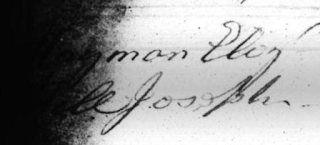
The above image is an unadulterated screenshot of a Vagrancy Removal Record from Middlesex County in the 1780s, found on the London Lives website. The original source contains lists of names of those forceably removed from Middlesex County. We've clearly got an Elizabeth "Eliz" and a Joseph here. But the contrast on the image is too high to make out their surnames. London Lives does offer full transcripts of everything on the website. Unfortunately, the transcribers were unable to decypher the names and left these particular entries incomplete. We too could pass them by, but if we are interested in what's underneath we can turn to a photo editing program to make an attempt.

This tutorial uses GIMP, a free open-source image processing program not unlike PhotoShop. Feel free to use the program with which you are most comfortable.

Step 1: Save the Original Image

I was using a Mac, so I took advantage of the handy screen capture feature (Cmd + Shift + 4), which allowed me to snag only the part of the image I was interested in correcting. Alternatively you could save the whole image by right-clicking it and using the "Save As" feature.

Step 2: Open the Image in an Image Processing Program

As mentioned above, if you do not already have an image processing program, try out GIMP. It is free after all.

Step 3: Adjust Brightness / Contrast

Open the "Brightness/Contrast" box located under the "Color" menu. Increase the brightness and contrast. In this example I've changed brightness by 118 and contrast by 103. Play with the sliders to get a result that works best for your particular source. You may even find it works better for you if you decrease one or the other. If you max out the values and need even more brightness or contrast, click OK and re-open the same dialogue box. This will allow you to repeat the process. You should notice some of the black blob beginning to fade and reveal hints of what might be underneath. This will probably occur first closer to the edge of the blob. You may now have all the information you need to finish the transcription. If so, great. If not, keep reading.


Step 4: Colorize

This feature is also located under the "Color" menu. This will help us to make the hidden letters pop out from amidst the shades of grey and black. Feel free to play with the sliders here to see if you can brighten up the results to the point where you are comfortable reading them. Sometimes I find it helps to decrease the "lightness" value while increasing the "saturation".

If you are still having trouble reading the words you can go back and repeat the process by again adjusting the contrast and brightness, and fiddling with the colours even more. If that doesn't work, you can move on to step 5.


Step 5: Trace What you Can See

For this step I like to use a USB tablet and pen, which lets me write to the screen in a fashion that's a bit more natural feeling than trying to draw using my mouse. If you don't have one you can do it with a mouse too. Choose the pen tool from the Toolbox and reduce the "Scale" of the brush to something appropriate for the size of the handwriting. Next, choose a nice bright colour that will stand out against the background colours you have chosen. Then, take your time and trace over whatever letters or bits of letters you can see.


As you can see from this example, we have been quite successful. What was once a "man Eliz" and a "ll Joseph" is quite obviously a "Hayman Eliz" and a "Hill Joseph". We did not get every part of every letter, but we did get enough new information to piece together the missing names.

This process may take a few minutes, but it can be worthwhile if your project depends upon decyphering the letters beyond the black blob. Unfortunately, it will not work in all cases. For this technique to work you do need a black blob with some shading variation. Computers store images as a series of coloured pixels with values ranging from completely black to completely white. Many black blobs are actually very dark grey blobs that look black to our eye. If there are shades of grey in your blob, and those shades correspond with the hidden letters underneath, as is often the case, then this technique may help you peel back the black and find what you are looking for.

Happy transcribing.

Friday, January 13, 2012

Citation in Digital Humanities: Is the Old Bailey Online a Film, or a Science Paper?

Recently I was writing a paper for a journal and needed to cite the Old Bailey Online (OBO). Not any particular piece of content contained in the project, but the project itself as an outstanding example of digital humanities work. For those unfamiliar with the venture, it's a database containing 127 million words of historical trial transcripts marked up extensively with XML; still the flagship project of its kind in this author's opinion. I found myself struggling to decide who the authors of the project were; that is, whose names was I bound by "good scholarship" to include in the citation. Who deserved public credit? I happen to meet regularly with one of the project's principle investigators, Tim Hitchcock of the University of Hertfordshire, and raised the issue with him over drinks at the pub - incidently the pub is the most engaging place to discuss topics as dry as citation practices and the discussion becomes increasingly more engaging as the evening progresses. As it happens, the project had over 40 known contributors who actively participated in its creation. His initial response was that the team decided not to include any names when citing the project to avoid leaving people out and focusing credit in the hands of only some of the team members. The resulting citation looks like this:

Old Bailey Proceedings Online. Version 6.0, March 2011. http://www.oldbaileyonline.org/

This is a very noble position for the project leaders to take; however, I do not believe it is the right position. In an effort not to emphasize the contributions of some over that of others, this policy makes most contributors entirely invisible. This is particularly significant for people in the alternative academic (alt-ac) fields whose career progression and in many cases, next meal, depend upon the strength of their portfolios. These people have roles such as project management, database building, and web design, all of which are crucial to ensure the projects themselves are world class. If we adopt the no-names policy across the board, these people will never be cited anywhere, whereas traditional academics may still have books and journal articles on top of their digital project work.

Though we brought our positions much closer together, the issue proved too much for a bottle of wine to solve. We parted ways and Hitchcock took the discussion to H-Albion, a list-serv for historians of Britain and Ireland where many historians and librarians have contributed their opinions. Seth Denbo then brought the discussion to Humanist, another list-serv for digital humanities scholars where a separate conversation has now begun. Rather than contribute to either or both of those conversations, I have decided to address the issue here with the hopes that it can find new contributors who may not otherwise see it in the list-servs.

The most interesting question to arise so far is whether digital humanities projects like the OBO are films or science papers. Not literally of course, but in terms of the model of credit offered to contributors of the finished product. Both films and science journals have developed unique models of credit. In films, the credits run at the end. In science papers, everyone who made a meaningful contribution gets listed as an author and those who made minor contributions get an acknowledgement. I will argue that digital humanists would be doing their field and industry a great service by adopting both models simultaneously. The OBO and projects like it are both films and science papers.

Films

One of the respondants to the list-serv discussion, a retired librarian Malcolm Shifrin, suggested that the point of a citation was to retrieve the source, not to provide credit. In this sense, it does not matter whose names appear in the citation, as long as there is no ambiguity and the item can be identified. However, if that were the case, we could merely cite ISBN numbers, which would drastically cut down on the size of footnotes. Or, in nearly all cases, titles alone would suffice. For example, if I were to task you with finding a copy of the paper: "An alternative definition of the scapular coordinate system for use with RSA" without any further information, I'm entirely confident you would make your way to a paper by my lovely wife, which appears in the Journal of Biomechanics. Citation is not merely about finding an item, it is also about credit; however, as Shifrim points out, it is not crucial that credit appears within a citation. An alternative model is the one used by the film industry in which a portion of the finished product is dedicated to letting everyone know who was involved with its creation.

Most major website projects, including the OBO, already do this. The OBO's "About this Project" page lists 24 of the leading contributors along with their roles and effectively mimics the credits on a film. A listing of this sort is important because it offers an official "in-house" acknowledgement that's difficult to fake without breaking the law and hijacking the website to add your name. This allows everyone to direct future potential employers to evidence of past work that can be independently verified. I would certainly argue that any collaborative digital humanities project should reserve a space on their website for such a page, which has absolutely no cost but can be instrumental to the future career development of your team members. But, I certainly do not think it's enough.

We do not know where the alt-ac world is going, and we would be wise to ensure that as many doors as possible remain open to those people who currently occupy this grey space in academia. Some members may aspire to a future tenure-track position and may find it difficult to convince more conservative senior faculty that film-style credits on a webpage are akin to hits on JSTOR. And because these conservative attitudes change slowly, it would be rash for digital humanists to abandon a well established if perhaps dated model of credit just because we want to rebel in the name of progress. There's a baby in that bathwater.

Science Papers

This is where the model used by the academic science community is particularly helpful. In the humanities, typically if someone got paid to do the work as part of a grant or part-time role, we pretend they didn't exist. The work "was done" rather than "was done by soandso". We don't expect McDonalds to list the names of individual "team members" when they brag about how delicious their french fries are. It doesn't matter who made your fries. They were paid to do so and thereby give up their right to credit.

In the sciences, everyone who makes a meaningful contribution is entitled to a share of the authorship of a paper. Assuming each of the 24 members of the OBO team met those criteria, a citation for the OBO might look like this:

Hitchcock T, Shoemaker R, Emsley C, Howard S, Hardman P, Bayman A, Garrett E, Lewis-Roylance C, Parkinson S, Simmons A, Smithson G, Wilcox N, Wright C, Clayton M, Bankhurst B, Lingwood D, MacKenzie E, Rogers K, McLaughlin J, Henson L, Black J, Newman E, O'Flaherty K, Smithson G. Old Bailey Proceedings Online. Version 6.0, March 2011. http://www.oldbaileyonline.org/

It may be a bit more of an eyefull than the previous example, but at least it's a more accurate reflection of the work people put into the site's creation. The exact criteria for determining a "meaningful contribution" generally rests with the policies of individual journals. A typical example, from the International Committee of Medical Journal Editors requires that each author must have made substantial contributions to all of the following:
  1. the conception and design of the study, or acquisition of data, or analysis and interpretation of data
  2. drafting the article or revising it critically for important intellectual content
  3. final approval of the version to be submitted

Obviously those criteria are designed specifically with a peer-reviewed journal article in mind. However, they can easily be adapted to the needs of a digital humanities web-based project, which typically is split into two parts: the project itself, and the digital infrastructure for allowing the audience to interact with the project. A digital humanities "author" could be someone that must have made substantial contributions to all of the following:

  1. the conception and design of the project or website; or acquisition of data or materials; or analysis, transformation and interpretation of data or materials
  2. drafting or creating any text, artwork, sound, video, workflow, interface, user experience, or code, that was integral to the success of the project and that would have been substantially different if it had been completed by someone else
  3. final approval of the finished product

In the case of the OBO, that may eliminate some people from the list of those credited with the project. As I am not one of those people, it is not my place to decide. But it is something I think as a community we should start discussing as soon as project teams are put together. What is the intended output, and how will each person's contribution be credited? It can be an awkward conversation at first, but it's a proactive solution to the elephant in the room for those in the alt-ac community.

Conclusion

The OBO is both a film and a science paper. Project leaders of web-based digital humanities projects would be doing their industry a favour by ensuring projects have both a page of film-style credits which outline contributors and their roles, as well as a science-style listing of substantial contributors or authors that are prominently displayed for anyone wishing to cite.

This two-pronged approach can only serve to help digital humanities to find its place within the academic world. It's the model that keeps the most doors open for those alt-ac members of our project teams who are unsure of which path their career will take in the future. It acknowledges the tremendous teamwork that goes into producing world class digital humanities work, setting them apart from single-authored papers. And it doesn't misrepresent or misconstrue the purposes of either model of credit. The citation may not mean much to a tenured professor, but it can help launch the career of someone in the alt-ac world. And so, the citation may be a bit clunkier if we use the science model, but at least it's an honest reflection.

Photo credit: "Steve Jobs rendered in Applesoft BASIC" by Blake Patterson.